
Context
What is Plotline?
Plotline is a SaaS product that enables marketers and growth managers to publish tooltips, modals, and bottom sheets (AKA in-app engagement) without requiring developer involvement.
What are Plotline Campaigns?
Plotline’s headline product Campaigns allows users to customize and publish in-app flows with multiple UI nudge types (tooltips, modals, spotlights, etc.) and any number of steps with custom filters for specific cohorts and time windows.
What was my role?
I was brought on as a fresh pair of eyes to look at the usability issues of the product and draw on my experience as a Product Manager. I was also leading the User Research and used this as an opportunity to set a regular cadence for user research at Plotline.

Design Brief
What was the issue?
Plotline's core proposition was the ability to go live with in-app campaigns effortlessly but was unwittingly introducing unnecessary friction with multiple UX issues in the campaign creation journey,
Why was this important?
This affected three metrics:
Time to publish campaign (from campaign creation; proxy metric for product complexity)
User penetration within organizations (hurt by high ‘Time to publish campaign’ and learnability)
Time taken by founding team to troubleshoot issues and field questions on campaign creation.
How might we create an easier, faster campaign creation experience by improving usability and eliminating redundancies in keeping with the product thesis?


Process (roughly speaking)
The process I followed is roughly summarized below. It doesn't come close to capturing the chaos and despair of having to convince the engineering team to build the feature though.
Understanding the Product
One of my first tasks was to design a clone app of Netflix and add the nudges in Campaigns to enable sales demos. This allowed me to do a quick UX audit to kickstart things, with the goal being understanding the ease of creating and editing a nudge campaign on Plotline.
but what's a campaign?
A snippet from the early UX audit exercise
Understanding the User

Speaking to a user about their workflow - from Figma to Plotline and the associated problems
The initial insights came from Posthog recordings, but over time switched to talking to our users regularly over Google Meet and Slack. These were people who were:
Primary Users
Responsible for growth metrics - feature adoption, conversions, etc
Using Plotline for in-app nudge campaigns
Looking to largely side-step engineering involvement
Medium to high design sensitivity, basic tech-literacy
Interview Focus
Understanding life as Marketing/Growth Managers
Plotline’s role in daily workflow - from concept to go-live
Points of friction in the workflow
Mental model of Themes vs. Templates
Product Challenges
1. The better part of valor is… requesting engineering a few basic fixes?
Often the easiest problems are also the most overlooked. These are the issues I discovered via the UX audit and Posthog recordings.
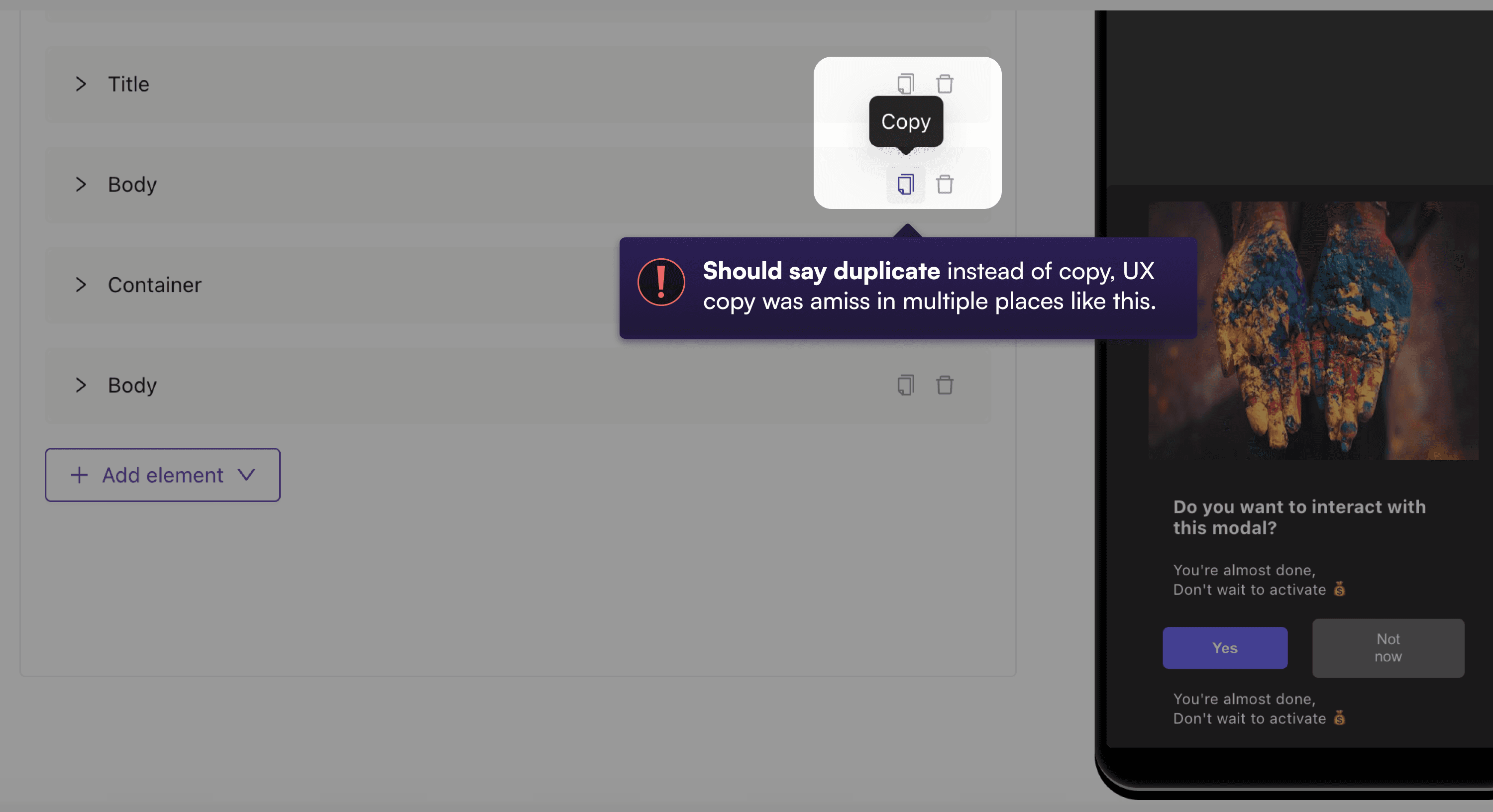
Some were low-hanging fixes - such as responsiveness or copy - that were quick code changes while others required deeper thought and design changes.
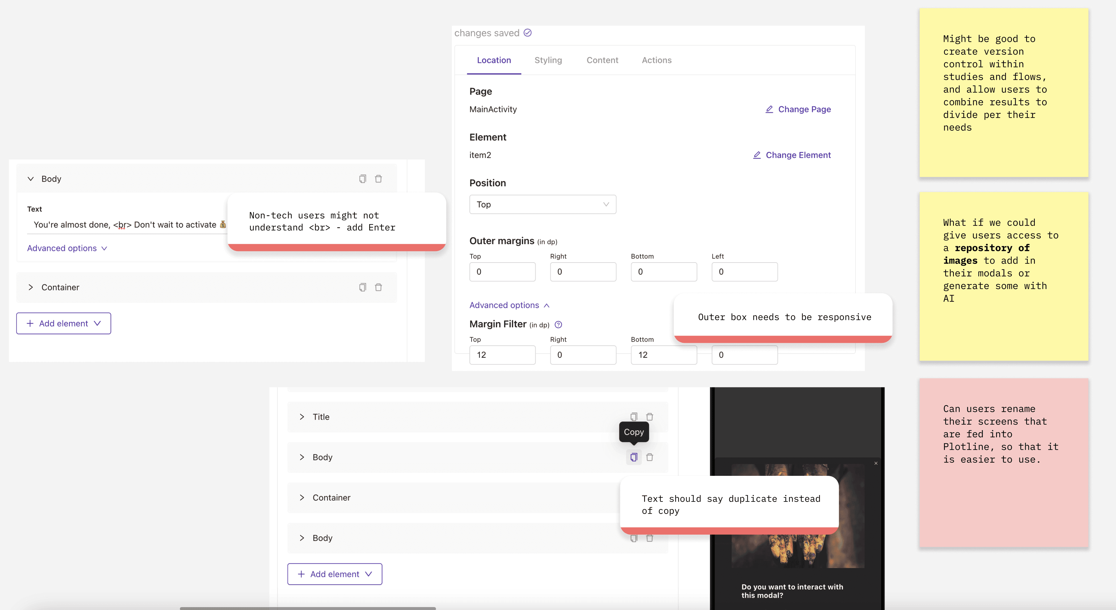
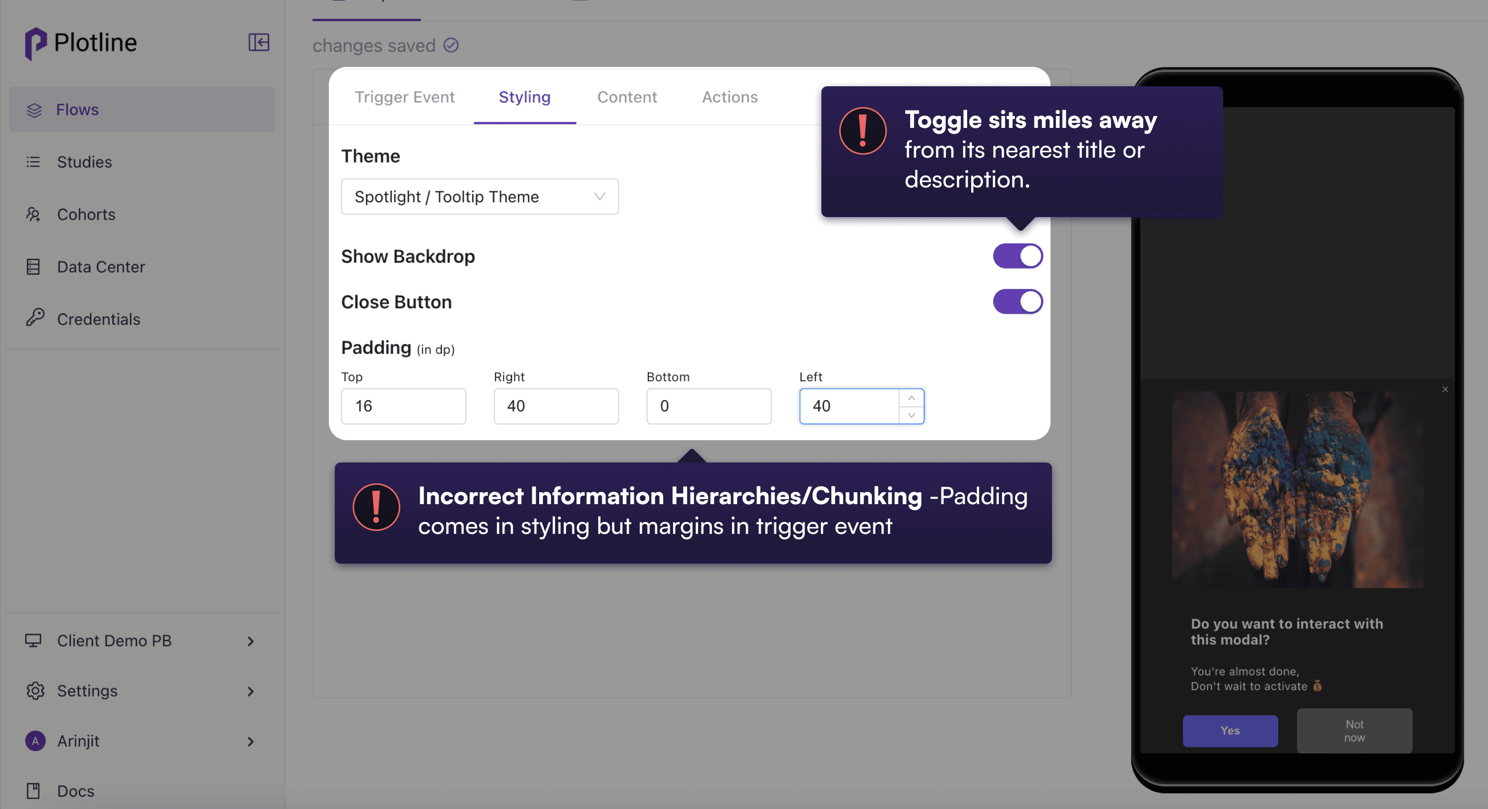
Part of the rework was the inconsistency in the information hierarchy. For example, margins appeared under 'Trigger' but somehow Padding appeared under 'Styling'.
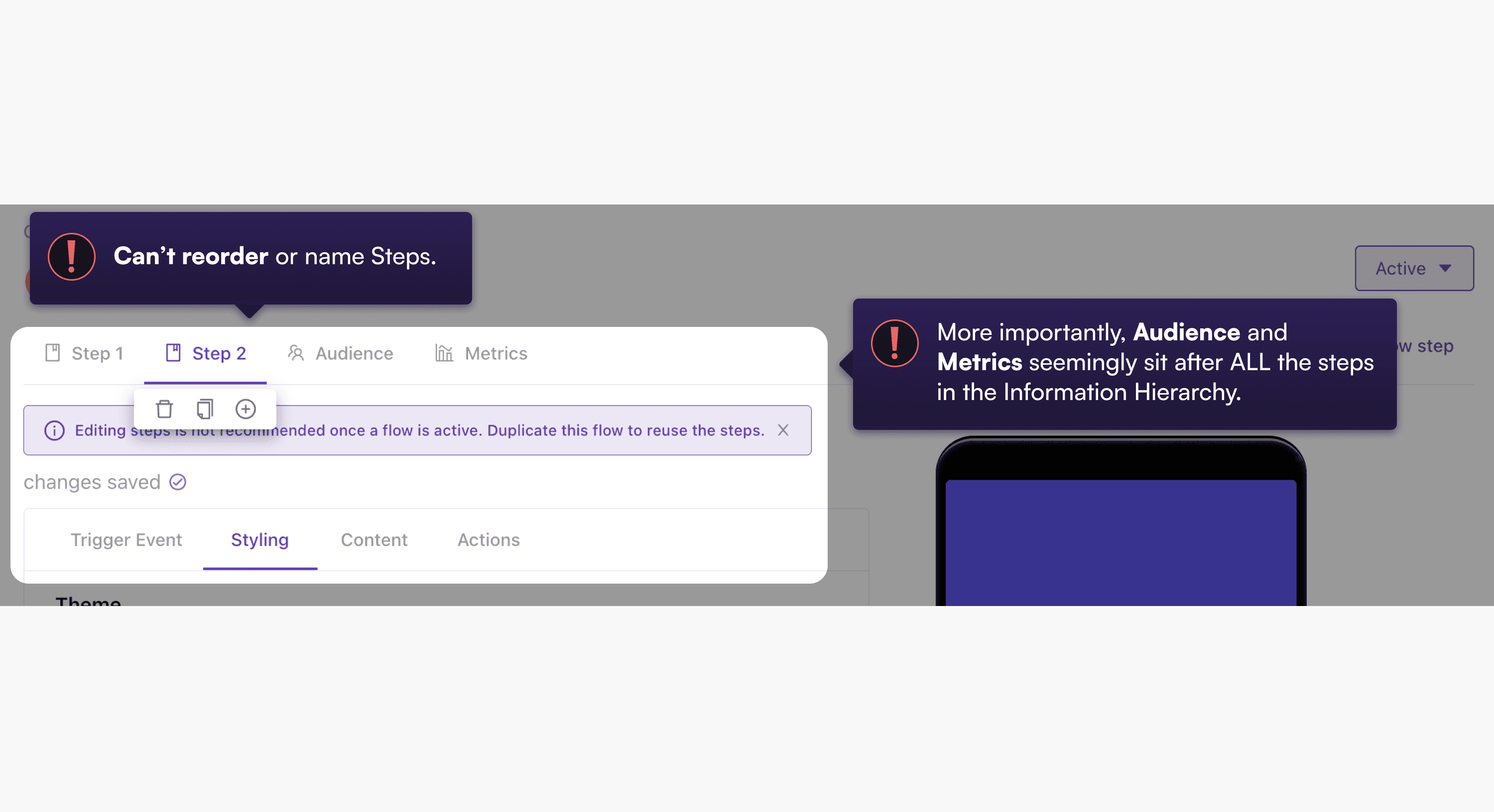
Another major issue which required some design thought was the inability to rename steps. When the each step was named 'Step N', it was easy to forget the contents of each step.
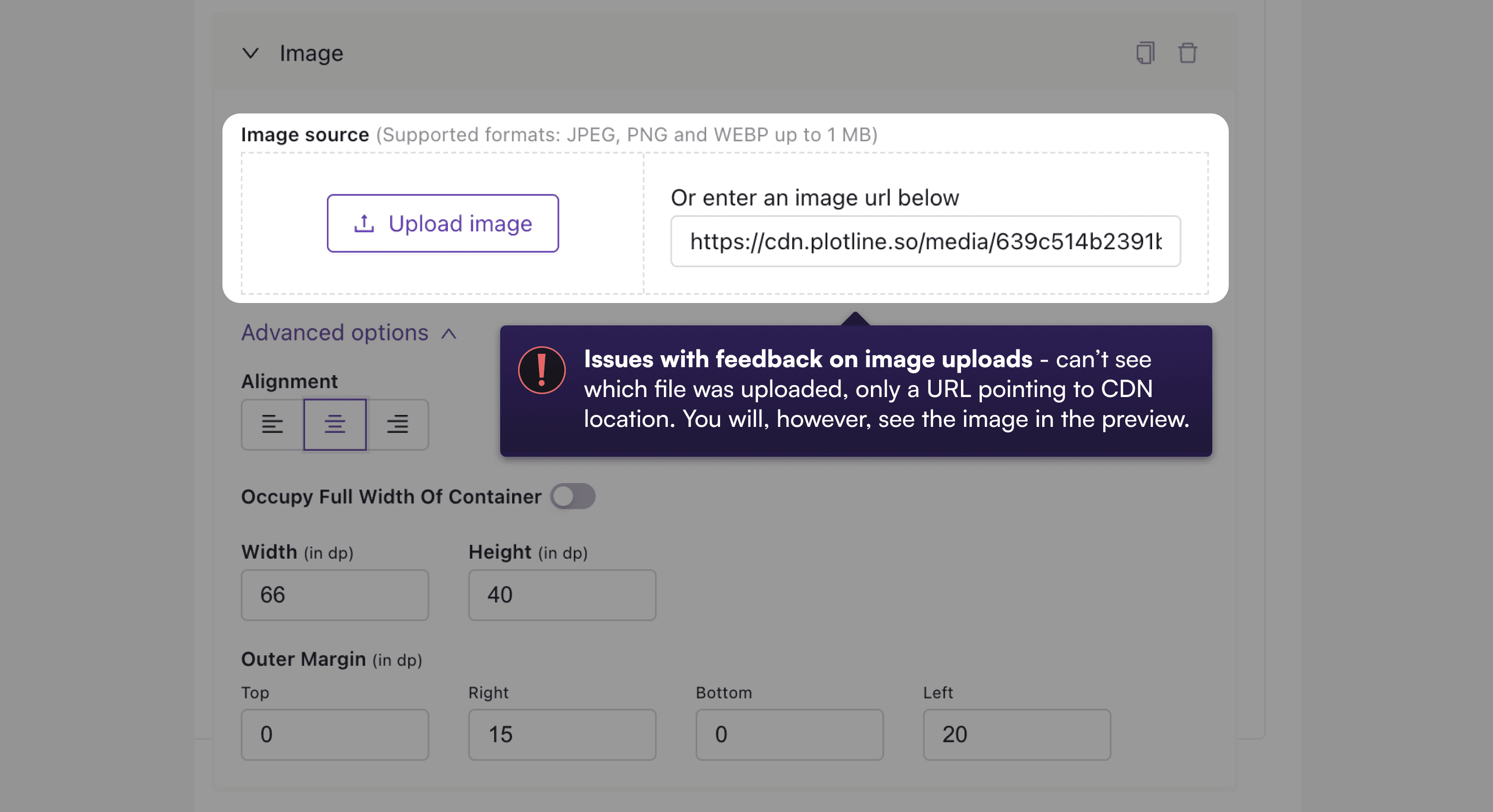

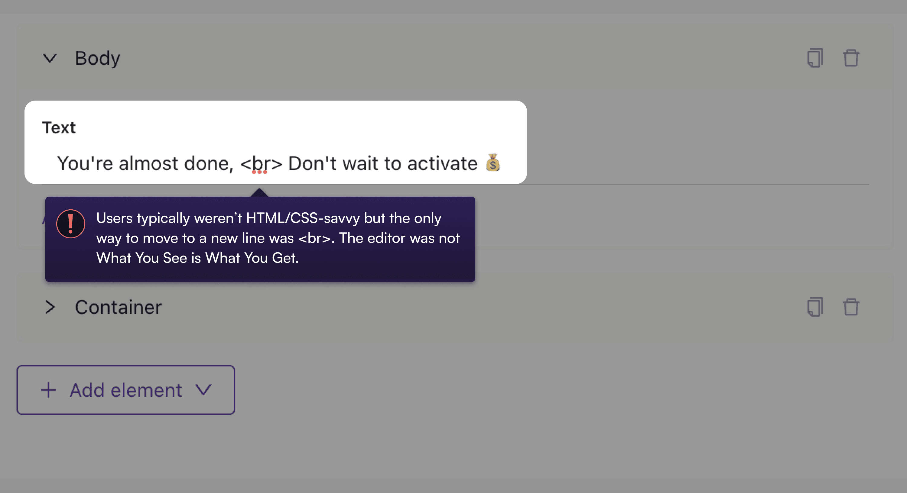
The many examples of broken usability within Campaigns
2. To theme or not to theme? And sorry, what was the question?
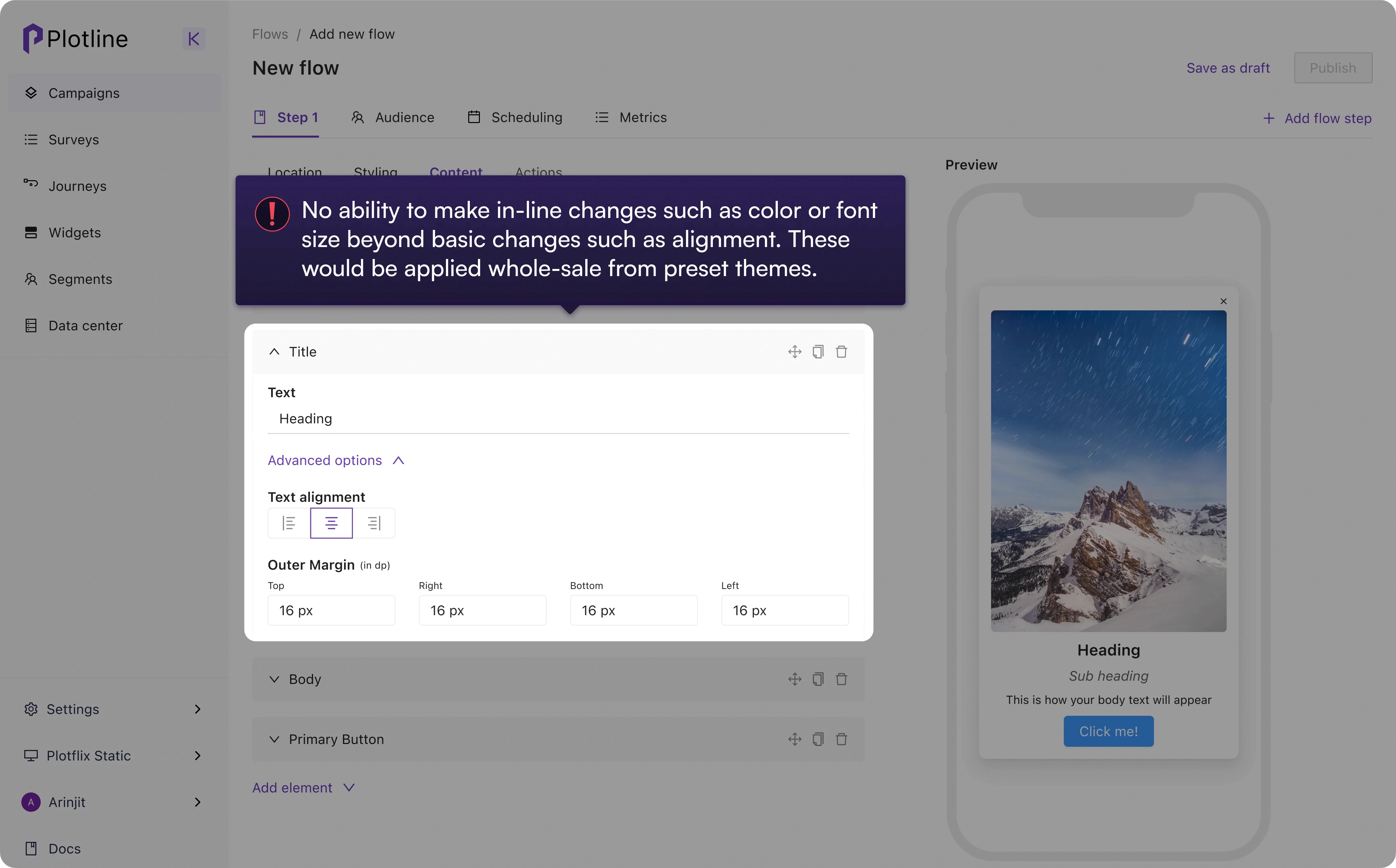
Perhaps the biggest usability issue by a country mile and a half was updating styling parameters - colors, font weights, font sizes, corner radii or background colors.
No in-line editing of themes: Users couldn’t change an element's styling property such as color while creating a campaign. They had to:
Abandon the campaign creation/editing flow
Go into the ‘Themes’ section to change the color & save the theme
Return to their creation flow to check the changes.
No edits to existing themes: If one wasn’t happy with the styling change they made, they had to duplicate the theme to change just one variable such as color and save as a new theme.
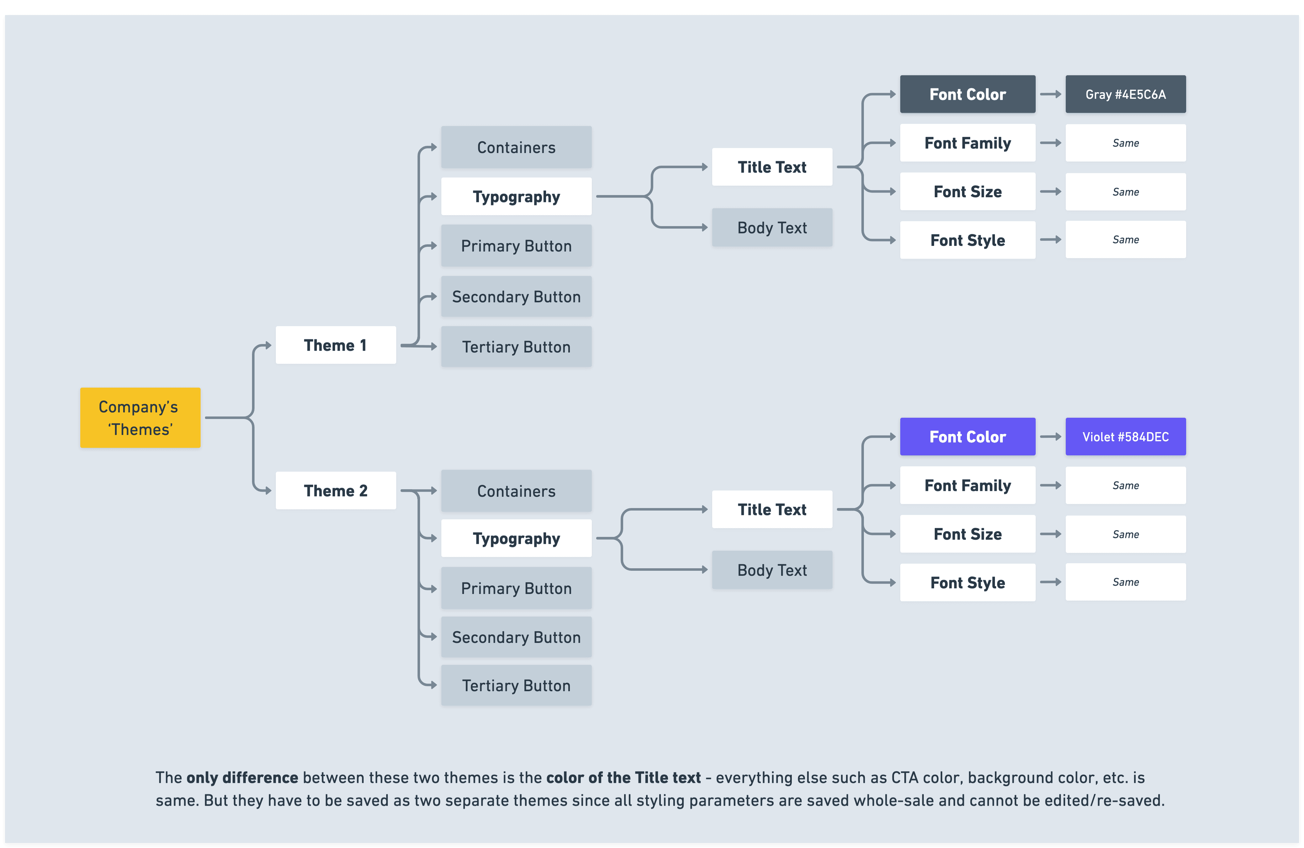

Explanation of how themes worked pre-intervention
3. What's in a template?
This still required considerable work, as users had to ensure that they changed the trigger events and campaign audiences. Occasional mistakes were costly.
The user might have wanted to use a tooltip with a GIF from one campaign and a modal from another, but could not duplicate and pull in those UI elements from multiple campaigns.
Screengrab of one of the clientsn showing a user hack for reusability. Users createad many duplicates of past campaigns when starting out due, in part, to the lack of styles and templates.
Delicious dilemma
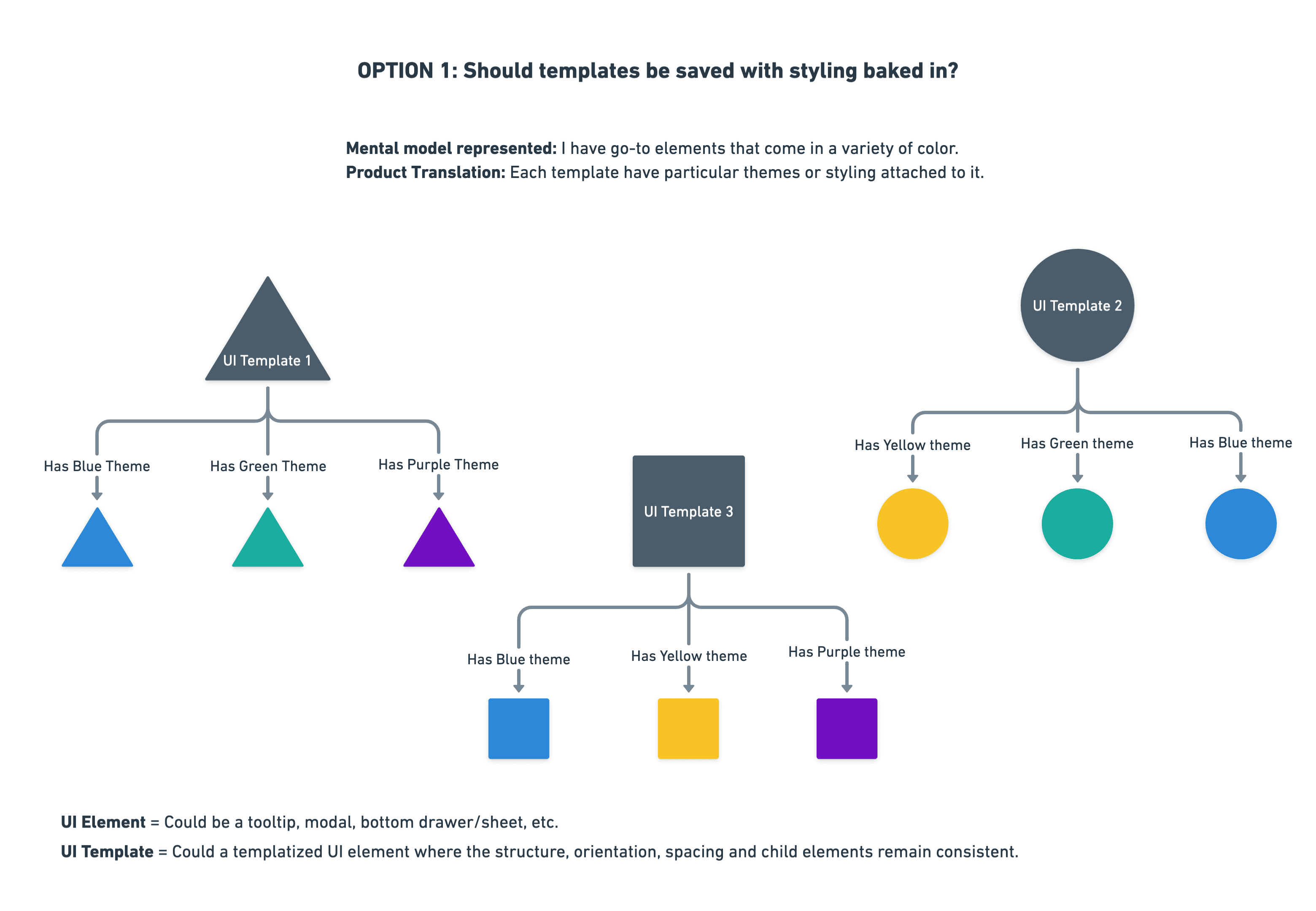
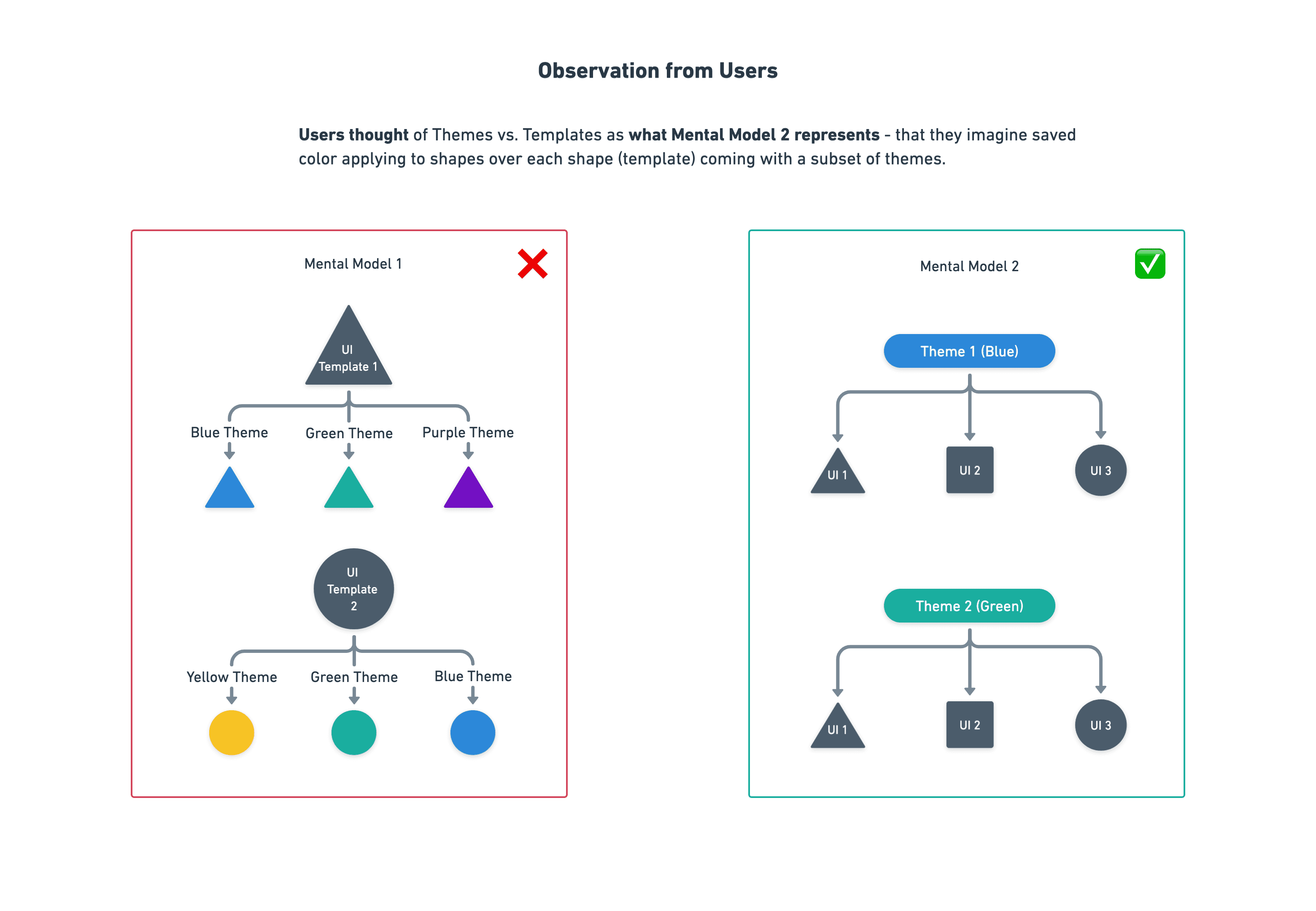
My co-designer believed themes should be a subset of templates for maximum efficiency. Users set up with go-to UI elements each with 3 or 4 themes.
My view was that themes should exist outside of any templates. These themes should exist independent of UI templates and apply variables relevant to the UI element in question.
Key insight
Do they think that themes apply to templates (colors can apply to a plethora of shapes)
OR go-to templates have distinct themes (each shapes comes in particular colors).

Final Design and Changes
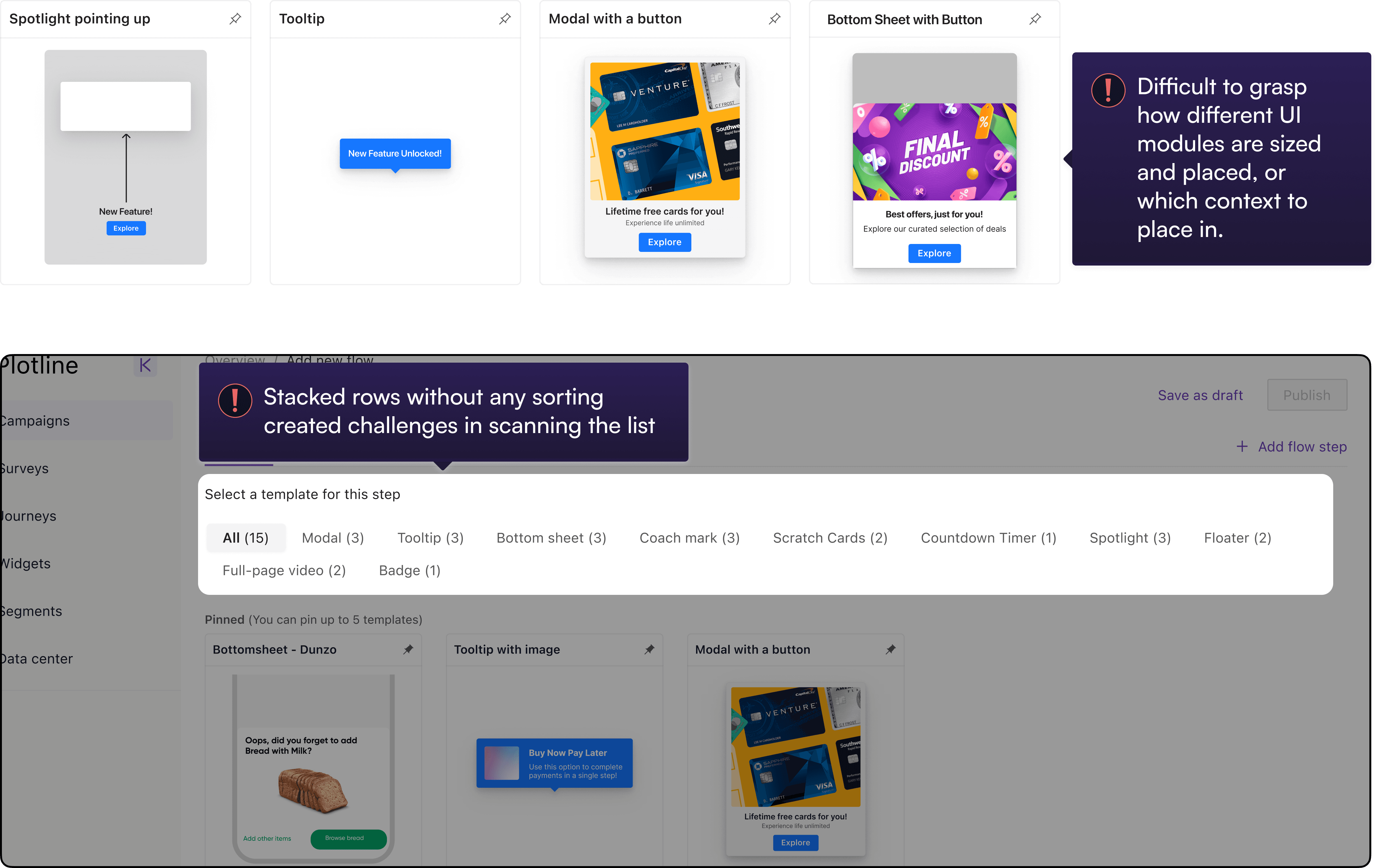
Reducing decision fatigue in choosing the right UI nudge
problems
There were no visual cues about the relative dimensions and positioning of the UI nudge when implemented on a phone screen.
UI Categories were hard to scan since it was presented both horizontally and vertically
decisions
Adding spatial context (with the phone frame) to understand relative size, positioning and suitability of the UI elements.
Changed UI Categories to a vertical list and moved it to the left for better scannability.

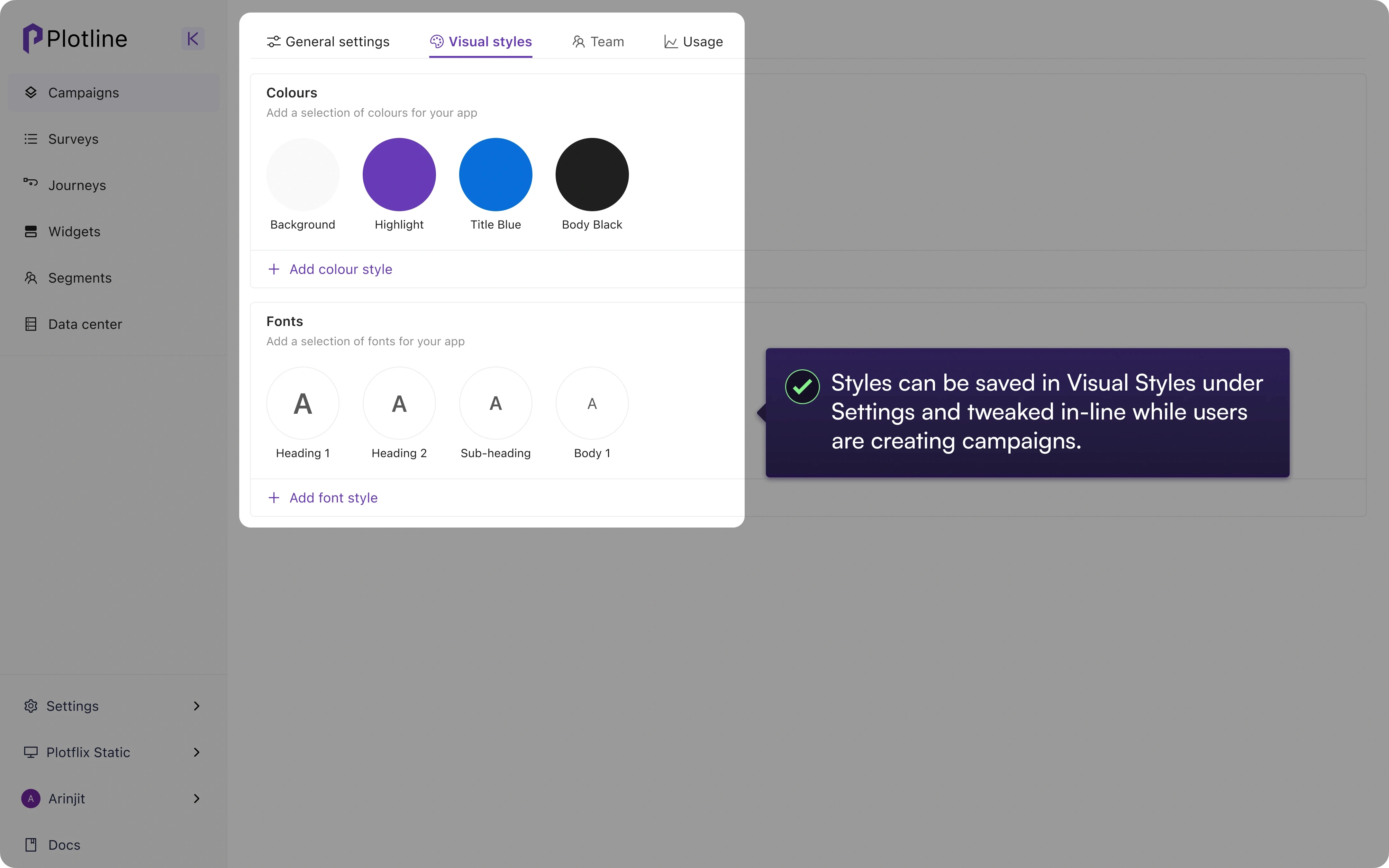
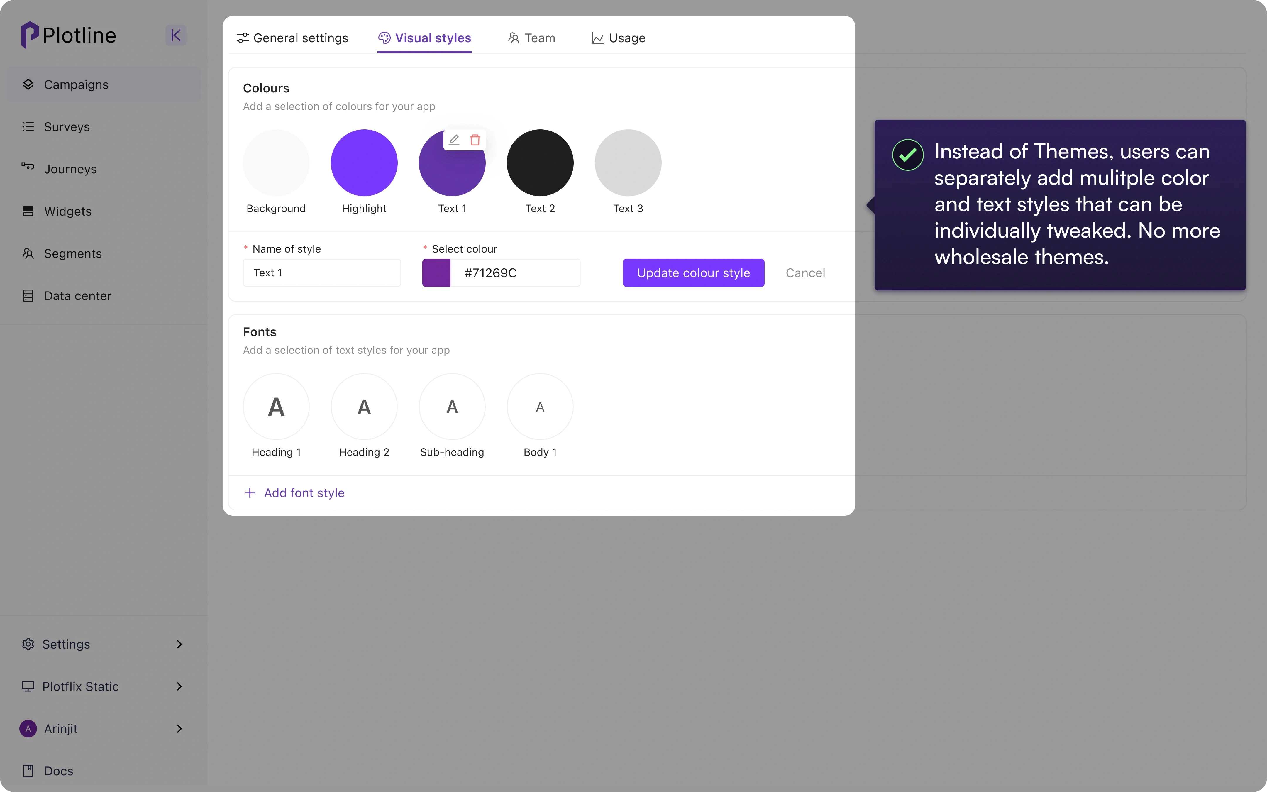
Introduction of In-line Editing and Reusable Styles
Easily the most impactful piece of the project
problems
Fonts and colors clumped together as 'Themes' and applied wholesale to a campaign. E.g. #3E3E3E for a button would be married to a particular font style for body copy.
No in-line editing capabilities meant users had to abandon the creation flow to change just one variable
Changes to Themes required overriding themes already in use or duplicating and saving as a whole new set of variables altogether for just one change.
decisions
Demerged color and font styles that can be individually tweaked and applied
Added in-line changes to colors and fonts with the added reusability of saving as styles
Small tweaks can now be made without having to create a whole new set of variables with for just one deviation - also reduced DB costs due to fewer style tokens.


Cleaning up the Information Architecture and Editor UI
problems
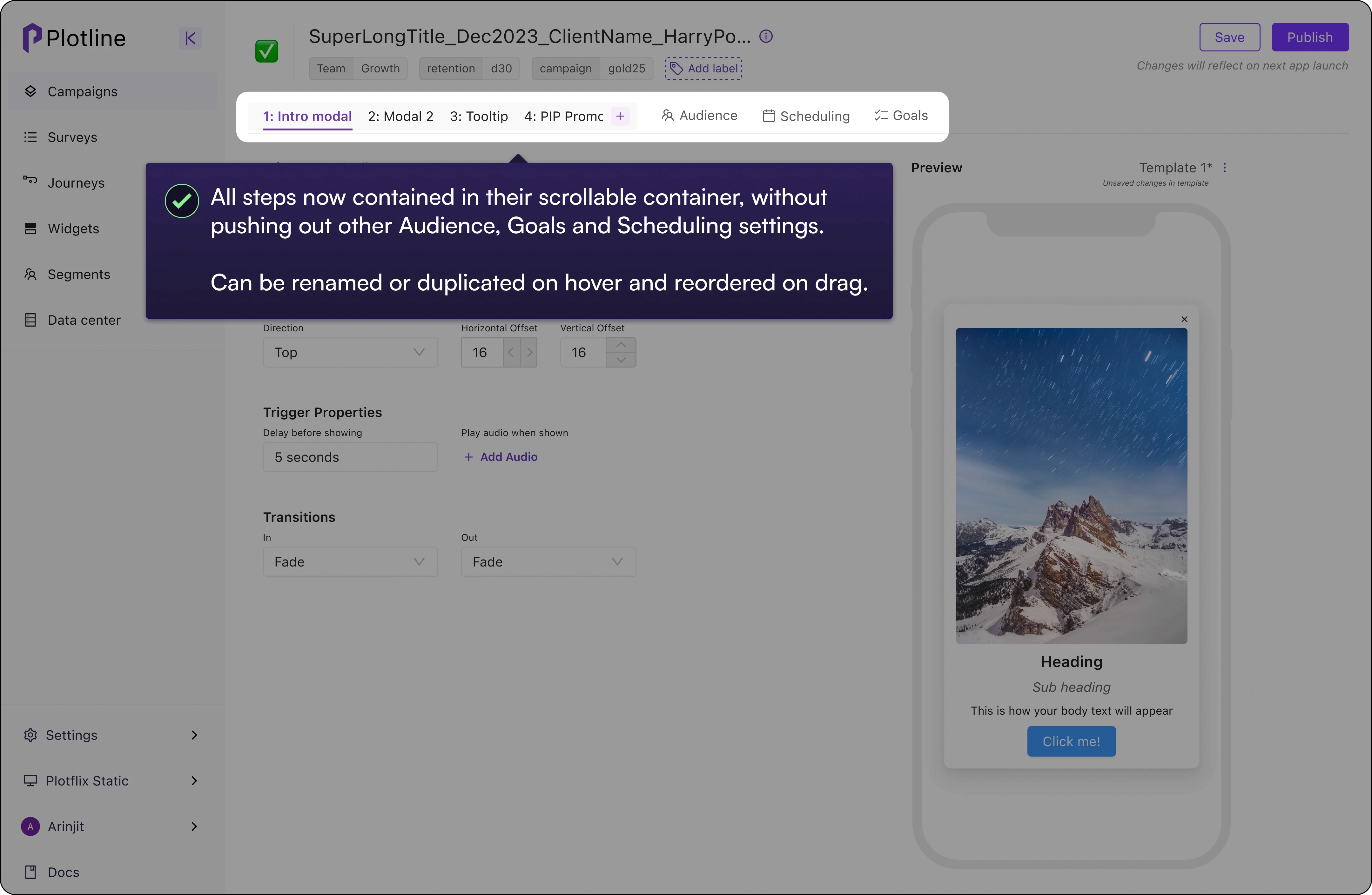
Inability to rename or reorder Campaign steps. Users would forget the contents of the steps and inadvertently make mistakes.
Inconsistencies in IA such as Padding and Margins appearing in two different sections.
Toggles and labels or certain CTAs set far apart, thus slowing down new users.
decisions
Steps are now contained in their own parent group and can be renamed and reordered (without having to delete a step and adding a new one in its stead).
Audience and Metrics now do not get pushed out of the user's locus of attention by Steps.
More logical grouping of settings and simplified input, such as allowing top-bottom, left-right inputs together while still affording individual tweaks.


Introduction of templates and visual spacing feedback
problems
Without templates, users would have to duplicate a whole campaign if they wanted to reuse just one successful step and then spend time removing unneeded steps.
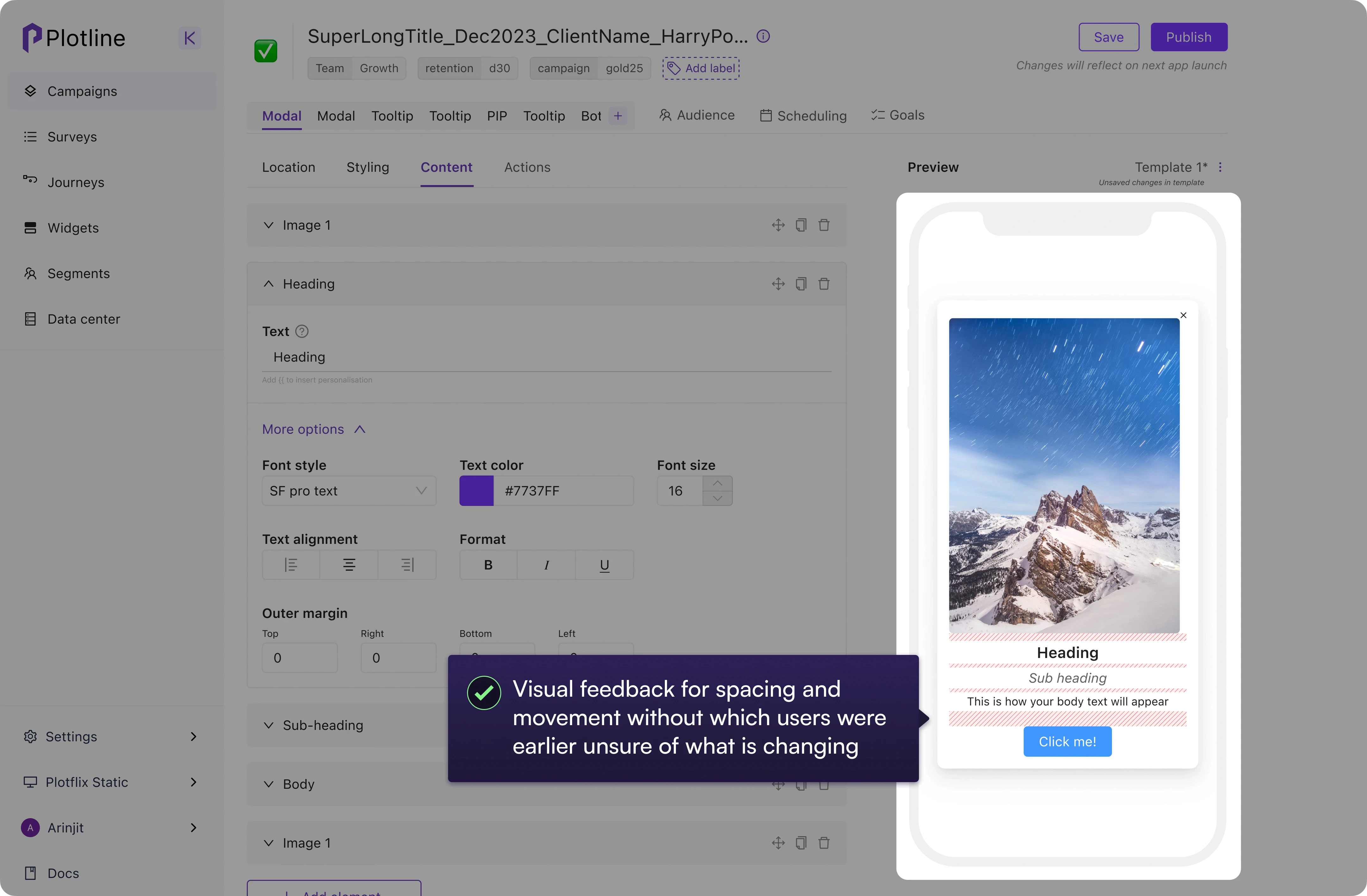
A lack of visual feedback on spacing meant moving elements by a few dozen pixels before users understood whether something moved or some sizing changed.
decisions
With the addition of templates, users could templatize and reuse combinations of styles, UI elements and assets without having to duplicate an entire campaign
Visual feedback like Figma allowed users to understand how much spacing and positioning values had changed in the fields on the left.


Impact of the Project
A redesign of the campaign creation process was long due and I was able to bring in a fresh set of eyes (though having been an early Plotline user myself previously).
A major outcome was also the hugely cutting down the time we spent walking users through campaign creation or doing custom work for them that cannot be expressed in hard metrics but surely freed up precious bandwidth.
While the improvements still had a long way to go, this one project spun off into more downstream and upstream improvements and helped mature product culture, such as regularly doing user research and gathering feedback from real users.
Campaign creation time roughly cut down by 50% (Example. from 1 hour down to 25-30 mins for a 3-4 step campaign)
Significantly reduced our server storage costs with elimination of duplicate themes and campaigns and streamlining of style tokens
Usability fixes as part of the project created a leaner, more usable platform for future nudge offerings such as grids and widgets
Learnings
01
Engineering time comes at a premium - so be wise
We had to pick between a zero canvas approach and an incremental improvement in the existing interface. While our initial lean was towards the ideal solution such as a WYSIWYG, infinite canvas with flows, it would have taken up too much of our roadmap and a lot of the efficiency gains in the campaign creation process came from simple fixes that took only a few hours to implement.
02
Mental models all the way!
Perhaps the only reason we were able to avoid lengthy debates was because of the feedback from users and understanding their mental models around concepts such as styles and themes. We were also surprised to learn that most users didn't know what margins and paddings were.
03
Nothing builds clarity and conviction like user feedback
A major win within the project was the start of our user research cadence and the inklings of a system (on a dedicated Slack channel to begin with) of collating these insights. These insights not only helped with product decisions at the micro level but also prioritization and aligning the team on important product issues at the macro level - even in a predominantly Sales-driven team.
04
Some wins are internal - and hugely valuable still
Along with another project for streamlining the dashboard experience, this project was a major unlock for the team's bandwidth since much of the team's time would go in tweaking campaigns for users or unblocking them with lengthy hand-holding calls. With fewer usability challenges, users relied much less on us which freed up bandwidth for actually shipping product.

